Select Page
FORTA | Educational Publication Design

FORTA | Educational Publication Design

Editorial Design

Client: FORTA
Role: Editorial design and page layout
Tools: Adobe InDesign, Adobe Illustrator, Adobe Photoshop

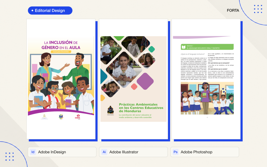
I designed educational publications for FORTA, including a guide to gender inclusion in the classroom and a cover for environmental practices in Honduran schools. These materials were developed collaboratively with specialist and institutional teams. My contribution was the editorial design and page layout.

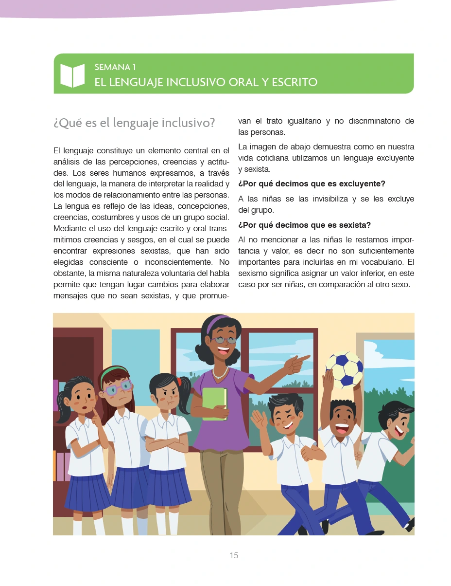
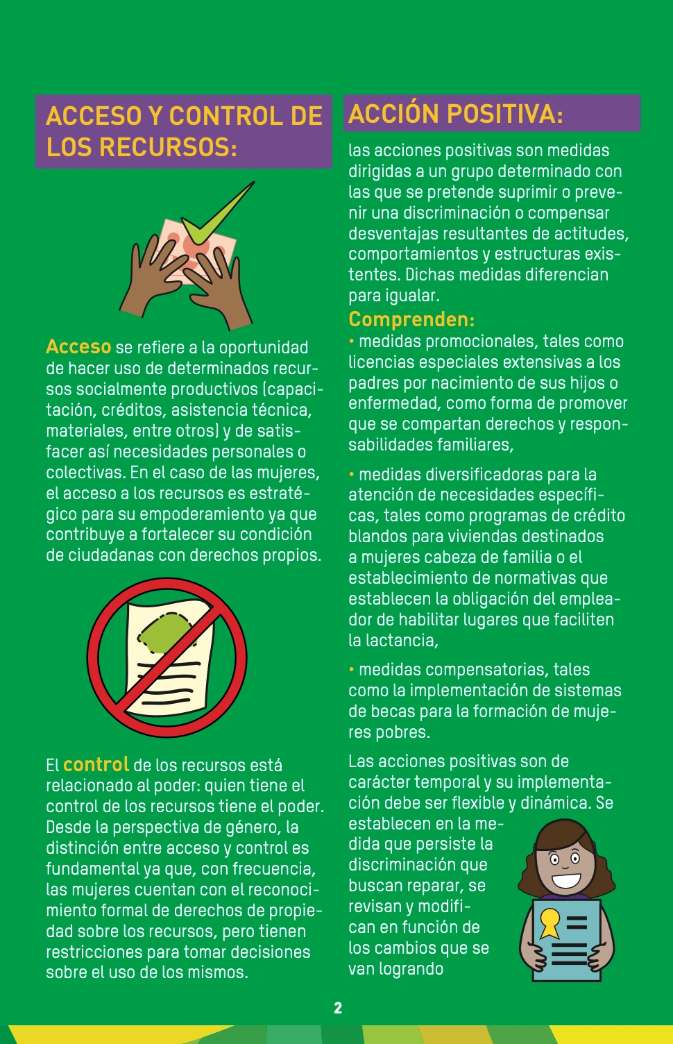
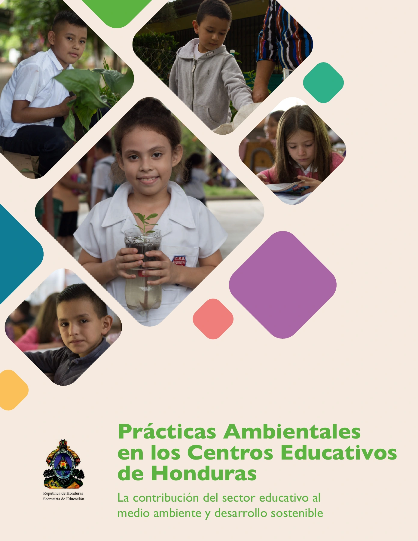
The gender inclusion guide pairs a clear typographic hierarchy with colored section markers and supplied classroom illustrations. Two-column layouts organize longer explanations, while larger illustrated areas provide visual pauses within the reading sequence. The environmental publication cover uses a photographic composition and geometric shapes to connect school activities with its subject.

I used Adobe InDesign to develop the layouts and maintain consistency across headings, body text, margins, and page elements. Illustrator and Photoshop supported the preparation and integration of graphic and photographic assets. The design process centered on making the supplied educational material readable, organized, and visually coherent.

The content and technical review were led by the collaborating teams. Illustrations in the gender inclusion guide are credited to Allan Paz; my role was to integrate them into the publication through layout and visual design.
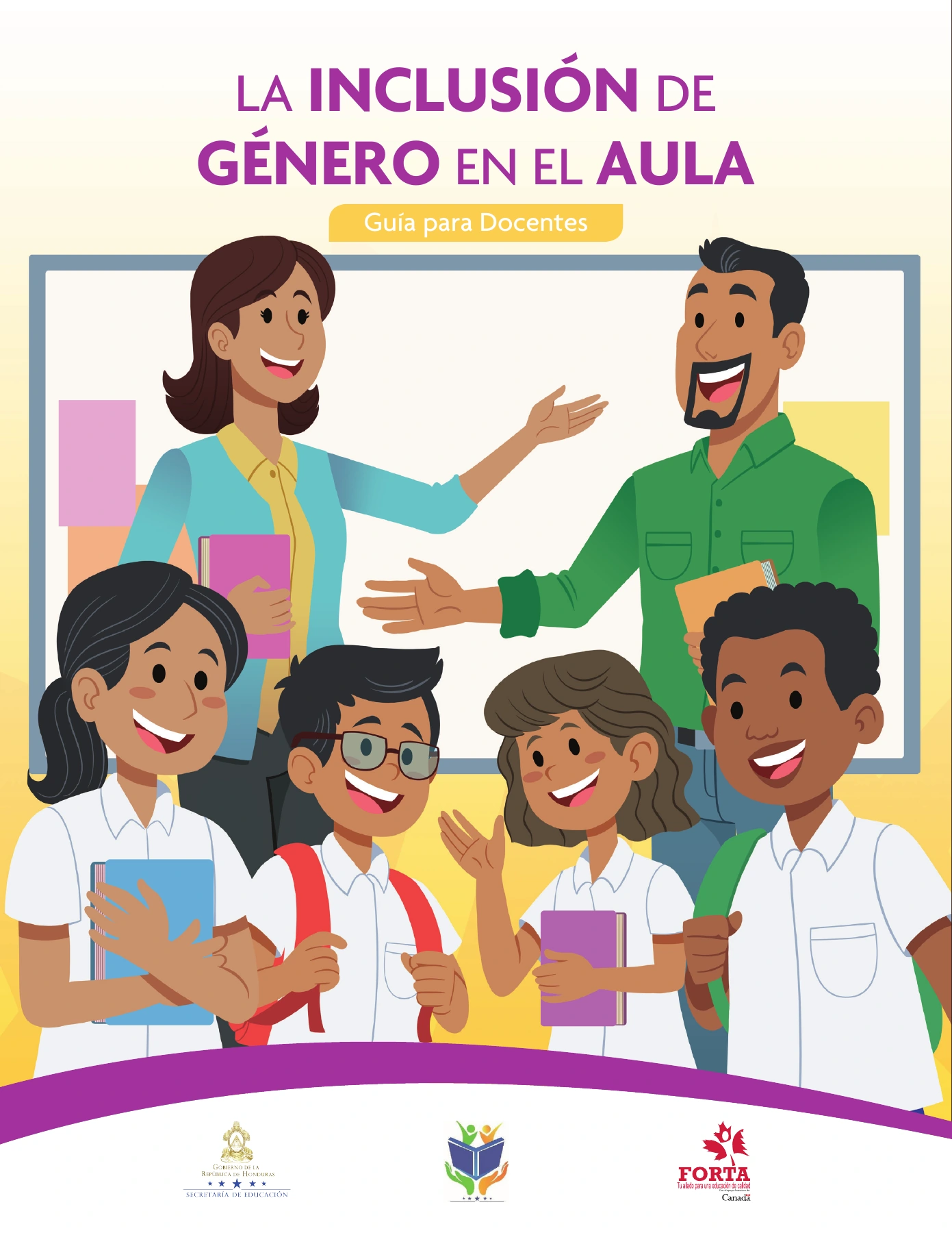
Gender inclusion teacher guide cover designed by Jaime Sosa for FORTA, integrating classroom illustrations by Allan Paz with purple and yellow typography.
Environmental practices publication cover designed by Jaime Sosa for FORTA, combining school photography, geometric shapes, and green typography.
FORTA guide page laid out by Jaime Sosa, featuring a green section heading, two-column text, and a classroom illustration by Allan Paz.
German Cooperation | Educational Editorial Design

German Cooperation | Educational Editorial Design

Editorial Design

Client: German Cooperation
Role: Editorial design and page layout
Tools: Adobe InDesign, Adobe Illustrator, Adobe Photoshop

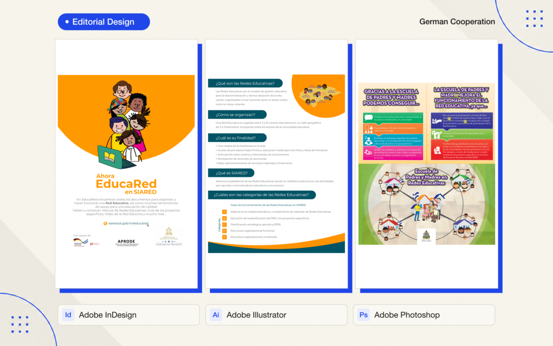
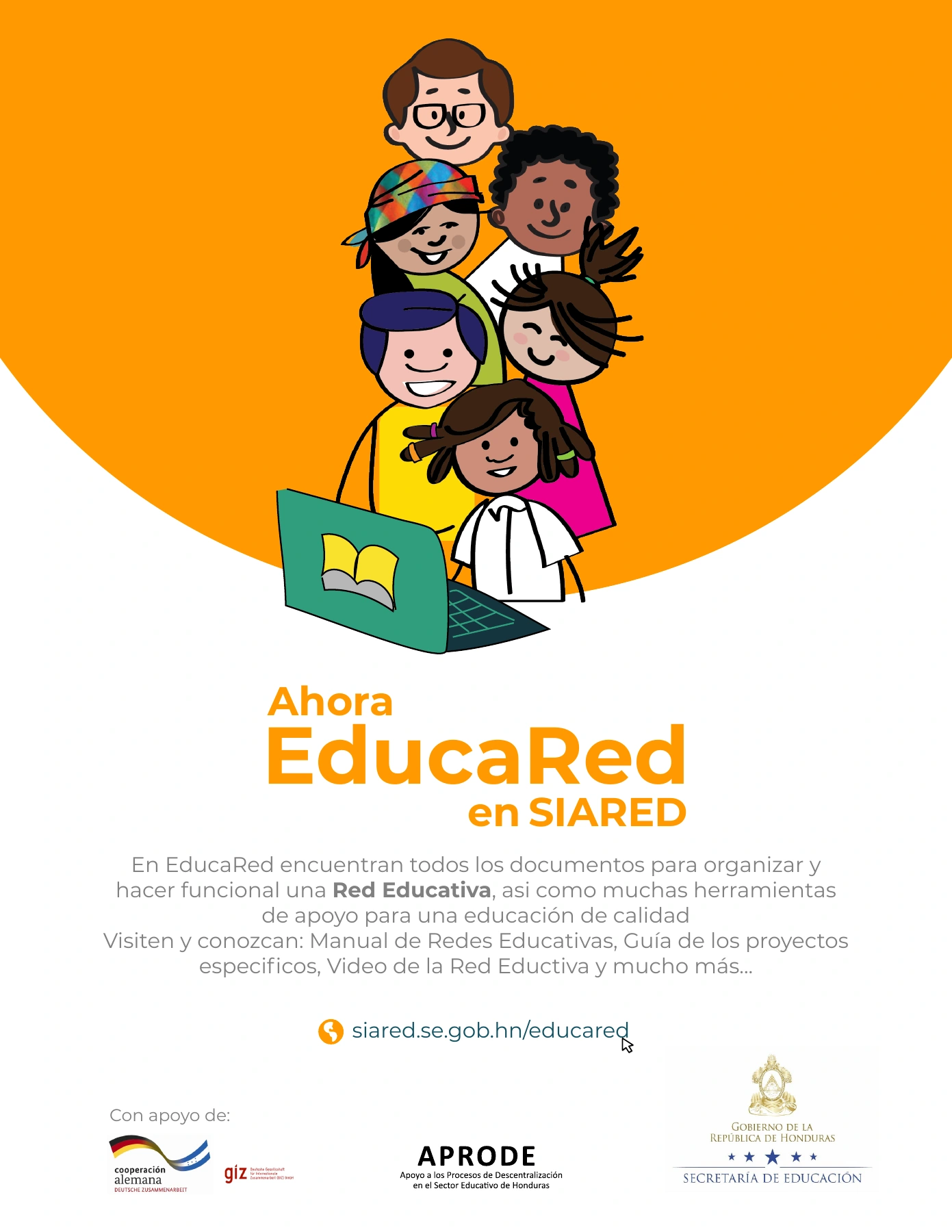
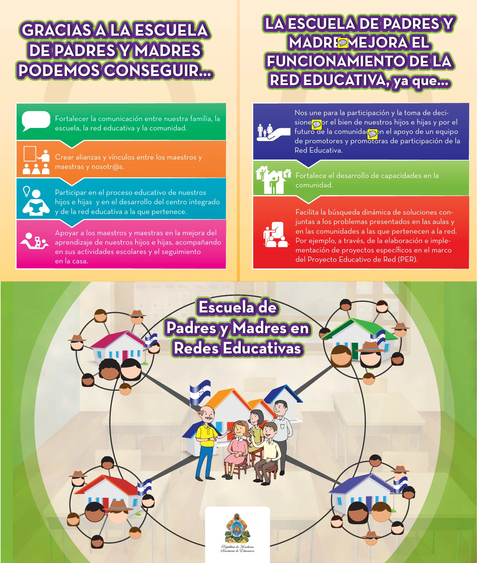
I designed educational communication materials for German Cooperation, including an EducaRed flyer and a brochure about parent participation in educational networks. The publications were developed with multiple project teams; my role focused on translating their supplied content into finished visual designs.

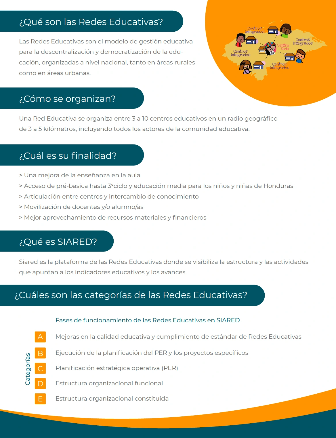
The EducaRed materials use teal headings, orange accents, and generous spacing to organize information about educational networks and the SIARED platform. The brochure combines colorful information panels with supplied illustrations to present connections between families, schools, and communities. Each format uses a hierarchy suited to its content and intended reading sequence.

Adobe InDesign supported the page layouts, typography, and arrangement of information across the flyer and brochure. Illustrator and Photoshop supported graphic asset handling and image preparation. My design work focused on readable text, consistent alignment, and the relationship between illustrations and explanatory content.

The project demonstrates my approach to educational editorial design: giving collaboratively developed material a clear visual structure while respecting the contributions of the content and illustration teams.

EducaRed flyer designed by Jaime Sosa for German Cooperation, featuring orange and teal graphics, educational illustrations, and structured typography.
EducaRed information layout by Jaime Sosa, using teal section headings, orange accents, and a clear hierarchy for educational network information.
School-family educational network brochure designed by Jaime Sosa, combining color-coded text panels and supplied community illustrations.
Oxfam Toolkit | Editorial Design

Oxfam Toolkit | Editorial Design

Editorial Design

Client: Oxfam
Role: Editorial design and page layout
Tools: Adobe InDesign, Adobe Illustrator, Adobe Photoshop

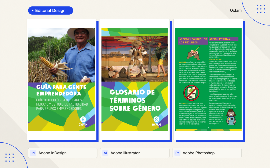
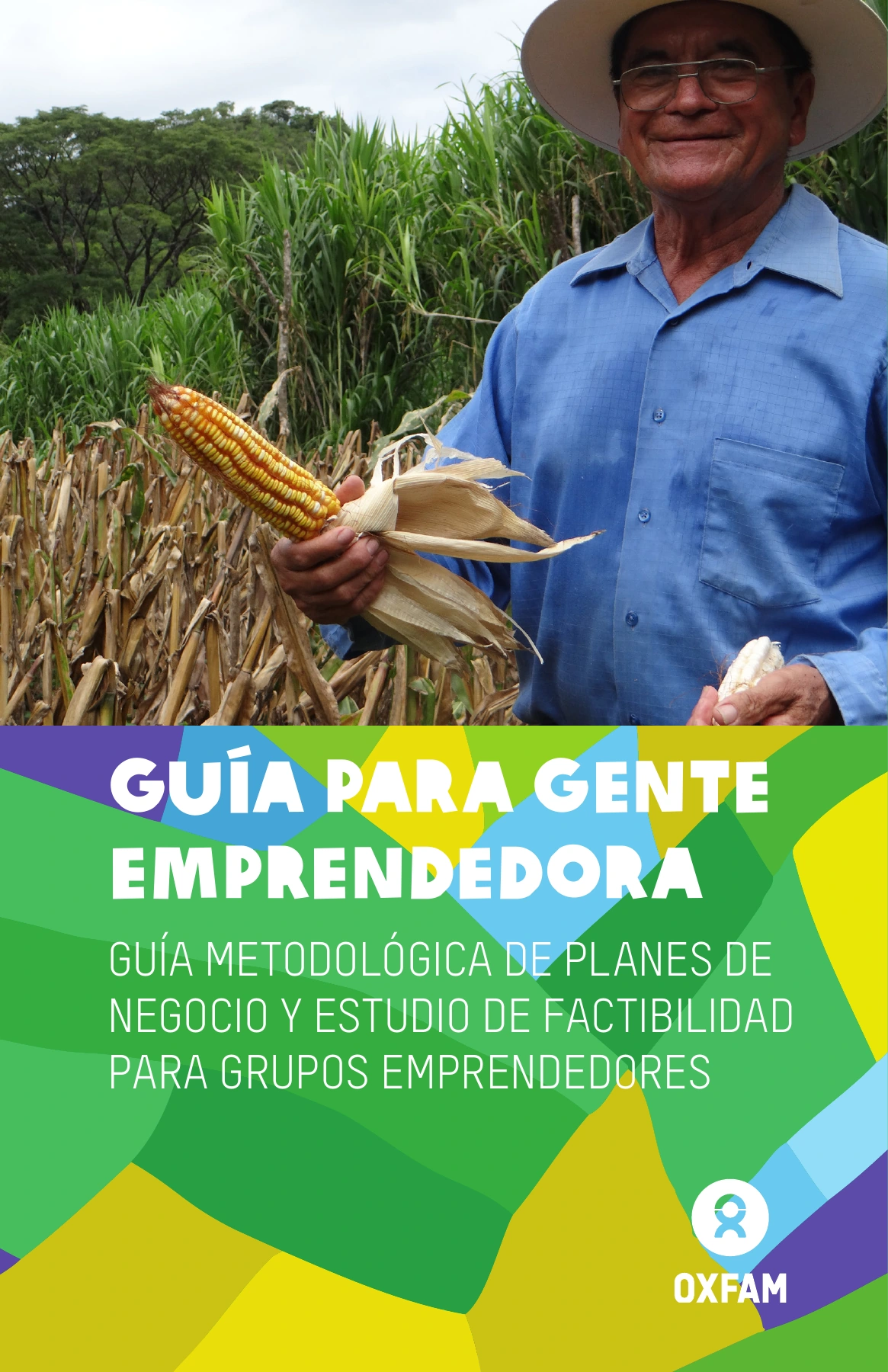
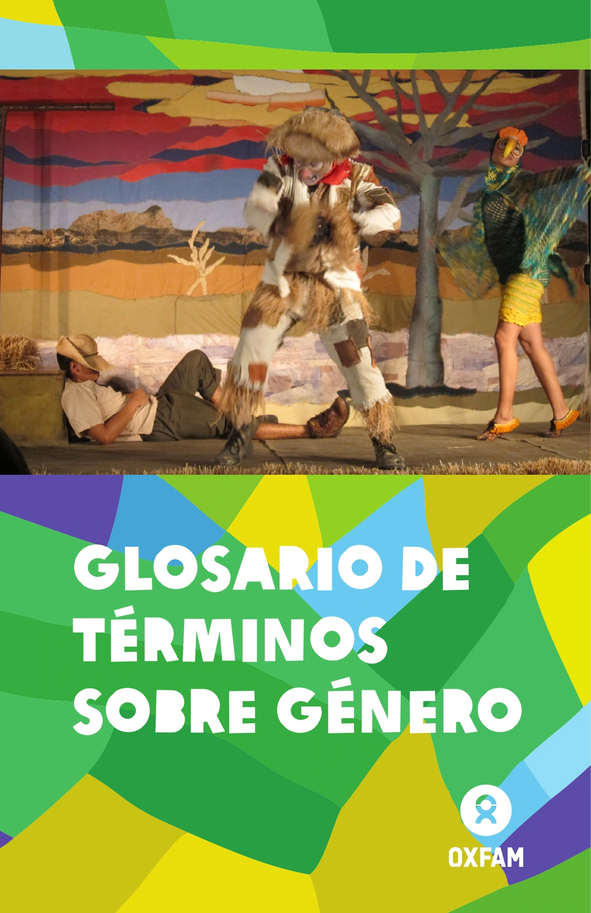
I designed a collection of editorial resources for Oxfam, including an entrepreneurship guide and a glossary of gender terminology. Developed collaboratively with consulting and technical teams, the project brought specialist content into a coordinated set of publications. My responsibility was the visual design and page layout.

The design connects the publications through a shared green palette, geometric color blocks, prominent typography, and photographic covers. Inside, clear headings, column layouts, and the integration of supplied illustrations help readers navigate definitions and practical guidance. The visual system gives the materials a recognizable identity while accommodating different types of content.

I used Adobe InDesign for page composition and typographic consistency, supported by Illustrator and Photoshop for graphic assets and image preparation. My focus was on organizing the supplied material, balancing text with visuals, and maintaining a consistent reading experience across the publications.

The written content, technical development, and supporting visual contributions were created by the collaborating teams and contributors. This portfolio entry highlights my editorial design and layout work.

Entrepreneurship guide cover designed by Jaime Sosa for Oxfam, combining photography, bold white typography, and green geometric shapes.
Gender terminology glossary cover designed by Jaime Sosa for Oxfam, using coordinated photography, typography, and geometric graphics.
Oxfam editorial layout by Jaime Sosa, with a two-column green page, purple headings, yellow accents, and supplied illustrations.