Select Page
Crypto for Good | Brand Identity & Campaign Design

Crypto for Good | Brand Identity & Campaign Design

Graphic Design

Client: The Giving Block
Role: Creative concept, visual identity, typography, and campaign design
Tools: Adobe Illustrator, Figma, Adobe Photoshop, Adobe After Effects

I developed the creative concept, visual style, design, and typography for Crypto for Good, a fundraising campaign for The Giving Block. The team provided the campaign name; I proposed its visual direction, which was reviewed and approved by the stakeholders.

The identity deliberately moved beyond the traditional visual language of donation campaigns. A vivid purple palette, expressive white typography, yellow accents, photography, and illustrative graphics made the campaign feel energetic and approachable. I used these elements to connect crypto culture with human stories and charitable impact.

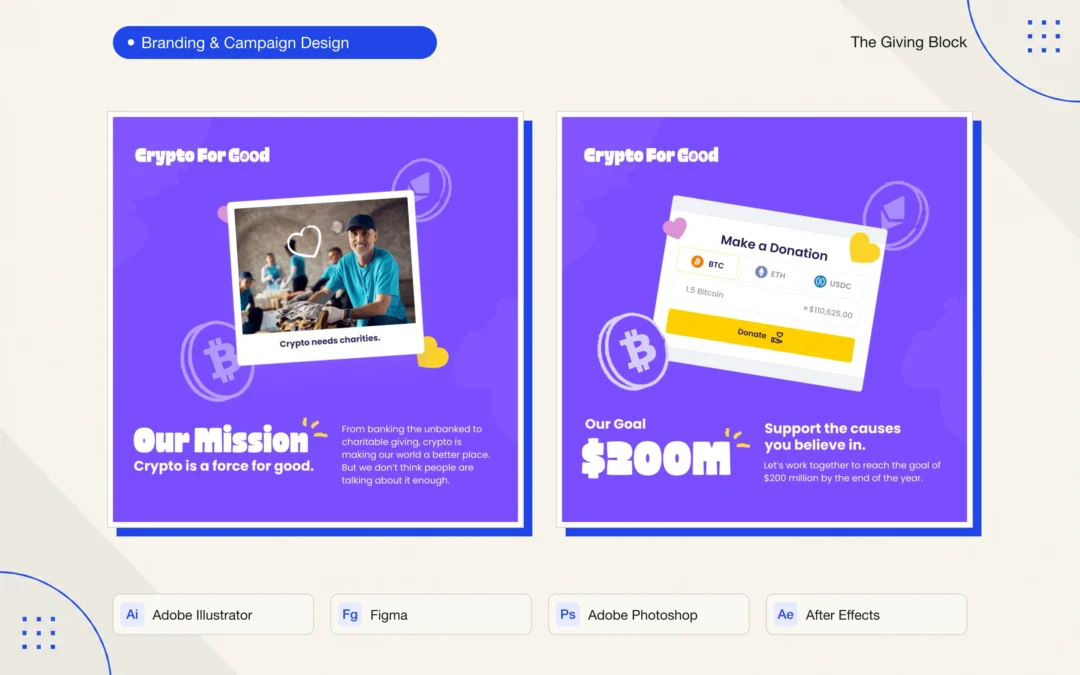
I built a visual system that could support branding, social media, video, and website design. The social pieces shown here cover the campaign’s mission and goal, donation updates, nonprofit categories, impact stories, and supporter recognition. Square and landscape formats demonstrate how the identity could adapt across channels while retaining a recognizable voice.

My workflow brought together Adobe Illustrator, Figma, Adobe Photoshop, and Adobe After Effects. The design work focused on the relationship between typography and imagery, a consistent hierarchy for campaign messages, and flexible compositions that could carry both emotional stories and fundraising information.

This was a turning point in my development as a designer. It expanded my work from individual promotional pieces into a connected campaign experience across brand, social, motion, and web—and strengthened my ability to present a creative direction and carry it through stakeholder approval.

The campaign was later discontinued due to legal concerns related to the use of its name. The name had been defined by The Giving Block team. This portfolio entry documents my approved visual proposal and design work, rather than an active campaign.


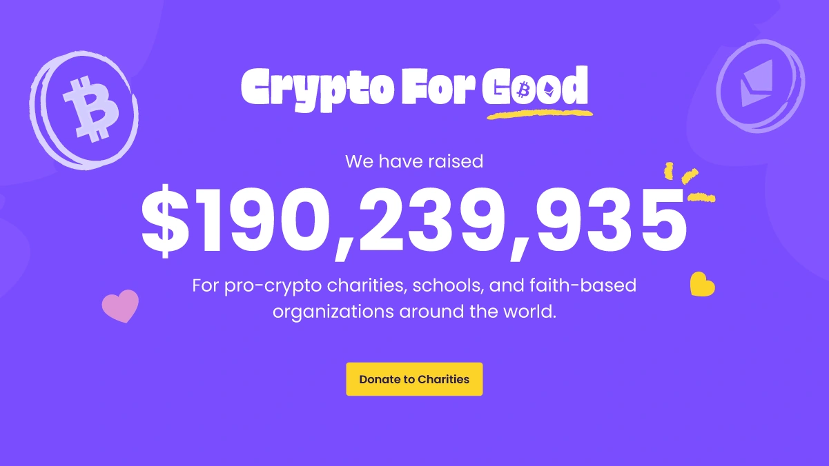
Crypto for Good visual identity designed by Jaime Sosa, featuring expressive white lettering, a yellow accent, and crypto graphics on a purple background.
Crypto for Good mission graphic designed by Jaime Sosa, pairing bold typography with a photographic card, hearts, and illustrative crypto graphics.
Crypto for Good goal graphic designed by Jaime Sosa, featuring a donation interface composition, large white typography, and yellow accents.
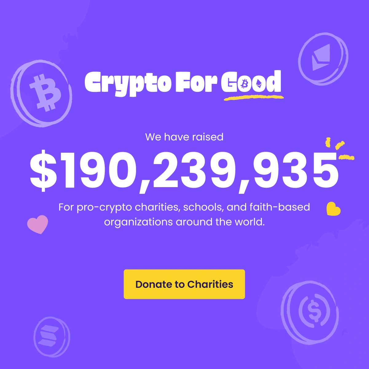
Crypto for Good fundraising update designed by Jaime Sosa, with prominent white numerals, purple campaign graphics, and a yellow call to action.
Crypto for Good nonprofit category graphic designed by Jaime Sosa, arranging photographs for education, animals, and health within white card frames.
Weekly donation graphic designed by Jaime Sosa for Crypto for Good, using bold white numerals, confetti, and purple campaign graphics.
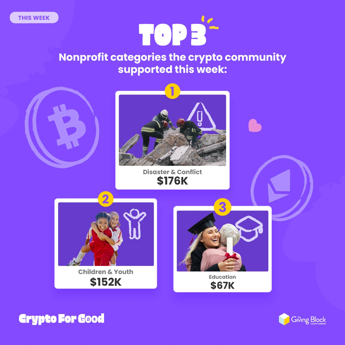
Crypto for Good weekly top-three graphic designed by Jaime Sosa, combining nonprofit category photographs, ranked cards, and donation figures.
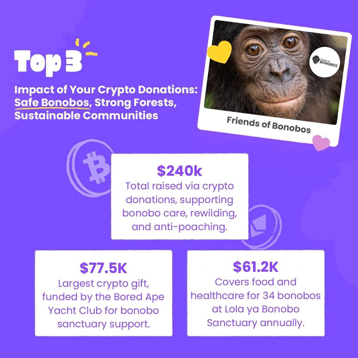
Crypto for Good impact graphic designed by Jaime Sosa for Friends of Bonobos, integrating a bonobo photograph, impact figures, and white information cards.
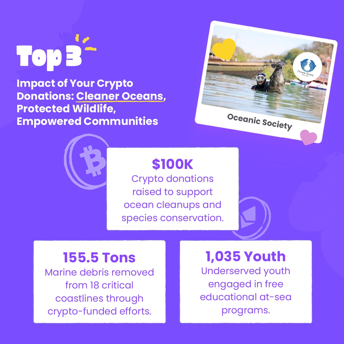
Crypto for Good Oceanic Society impact graphic designed by Jaime Sosa, combining a conservation photograph, bold headings, and fundraising information panels.
Crypto for Good supporter recognition graphic designed by Jaime Sosa, with oversized white thank-you lettering and subtle crypto illustrations on purple.
Landscape mission graphic designed by Jaime Sosa for Crypto for Good, adapting the campaign typography, photography, and purple visual system for social channels.
Landscape campaign goal graphic designed by Jaime Sosa for Crypto for Good, balancing large typography with a donation interface and yellow accents.
Landscape fundraising update designed by Jaime Sosa for Crypto for Good, using centered typography, a donation total, and the campaign’s purple graphic identity.
TeamWater | Crypto Donation Social Campaign

TeamWater | Crypto Donation Social Campaign

Graphic Design

Client: The Giving Block
Role: Social media design and visual composition
Tools: Adobe Illustrator, Figma, Adobe Photoshop, Adobe After Effects

I designed social media graphics for The Giving Block’s promotion of crypto donations to TeamWater. The work supported a campaign associated with MrBeast and focused on making the connection between crypto giving and access to clean water immediately understandable in a social feed.

My contribution was the design and visual composition of the promotional pieces. I brought together photographs, crypto symbols, campaign branding, and concise messages within a coordinated blue visual system. Strong headlines establish the message, while yellow accents, hearts, and energetic background rays guide attention toward the campaign and its call to donate.

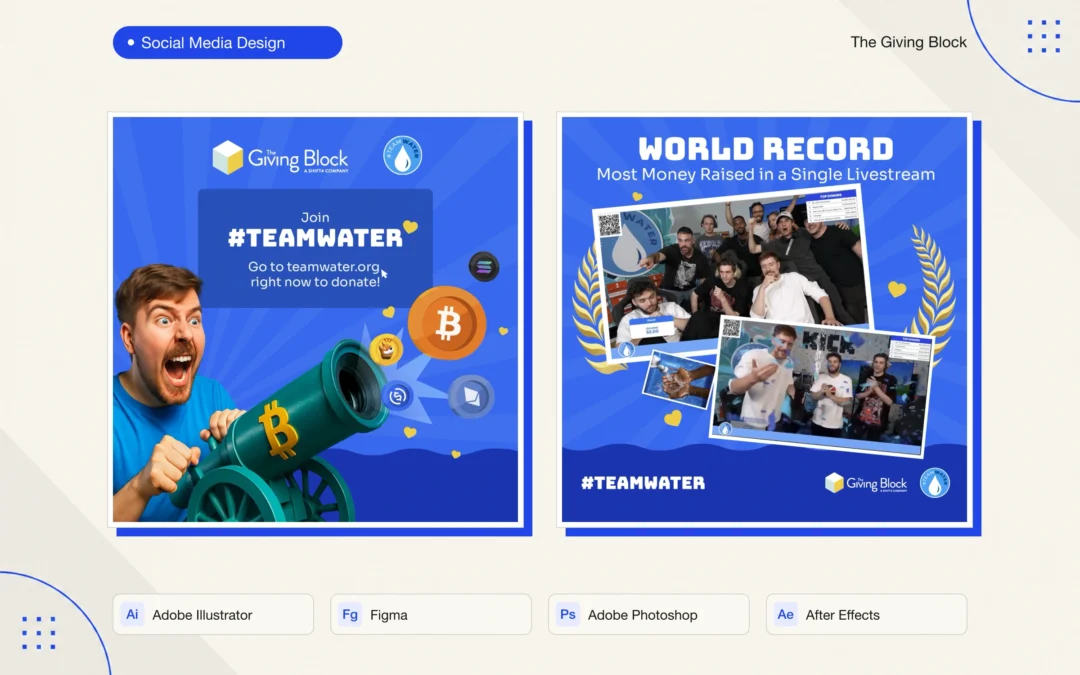
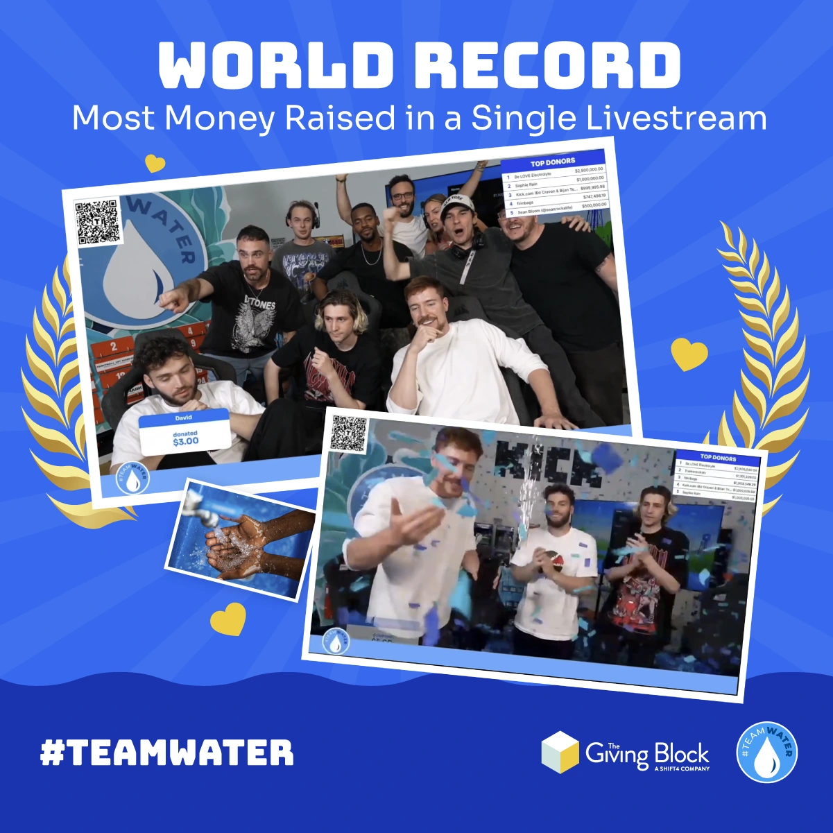
The collection includes a MrBeast composition with a crypto-themed cannon, a photo-based piece connecting the campaign with clean water, and a graphic celebrating the record-setting fundraising livestream. Each piece adapts the same visual language to a different communication need: participation, purpose, or campaign momentum.

My workflow used Adobe Illustrator, Figma, Adobe Photoshop, and Adobe After Effects. The static pieces shown here highlight typography, image composition, asset integration, and consistency across the campaign’s social media communications.

This project demonstrates my ability to translate a collaborative fundraising initiative into clear, engaging promotional design while working within an established campaign identity.

Campaign context: The Giving Block’s TeamWater case study

Social media graphic designed by Jaime Sosa for The Giving Block’s TeamWater promotion, featuring MrBeast, a crypto-themed cannon, and a donation message.
TeamWater social media design by Jaime Sosa, combining MrBeast holding a glass of water with clean water photographs, crypto symbols, and a donation call to action.
TeamWater livestream record graphic designed by Jaime Sosa, using bold white typography, a photographic collage, and yellow accents on a blue background.
Adobe MAX 2025 | Tarot Portrait & AI Design

Adobe MAX 2025 | Tarot Portrait & AI Design

Graphic Design

Event: Adobe MAX 2025
Workshop: Russell Brown’s Adobe MAX pre-conference class
Role: Visual design, photo compositing, and AI-assisted image creation
Tools: Adobe Photoshop and Adobe Firefly

I created this personal tarot portrait during Russell Brown’s Adobe MAX 2025 workshop, bringing together the techniques and experiments explored throughout the classes. Working with an influential Photoshop educator made the experience especially meaningful: it gave me space to explore unfamiliar approaches and push my visual design further.

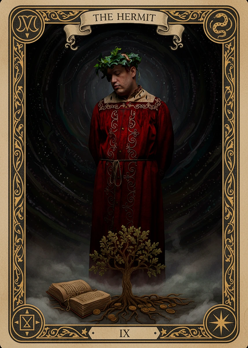
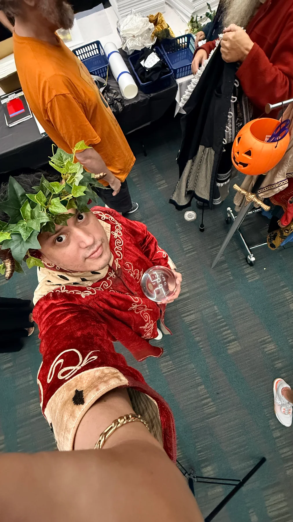
The portrait is me, photographed as part of the workshop project. That photograph became the starting point for an imaginative self-portrait, developed primarily with Adobe Photoshop and Adobe Firefly. I explored AI-assisted imagery and used Photoshop to shape the composition into a cohesive tarot card, balancing the central figure with an ornamental border, symbolic details, and a carefully considered atmosphere.

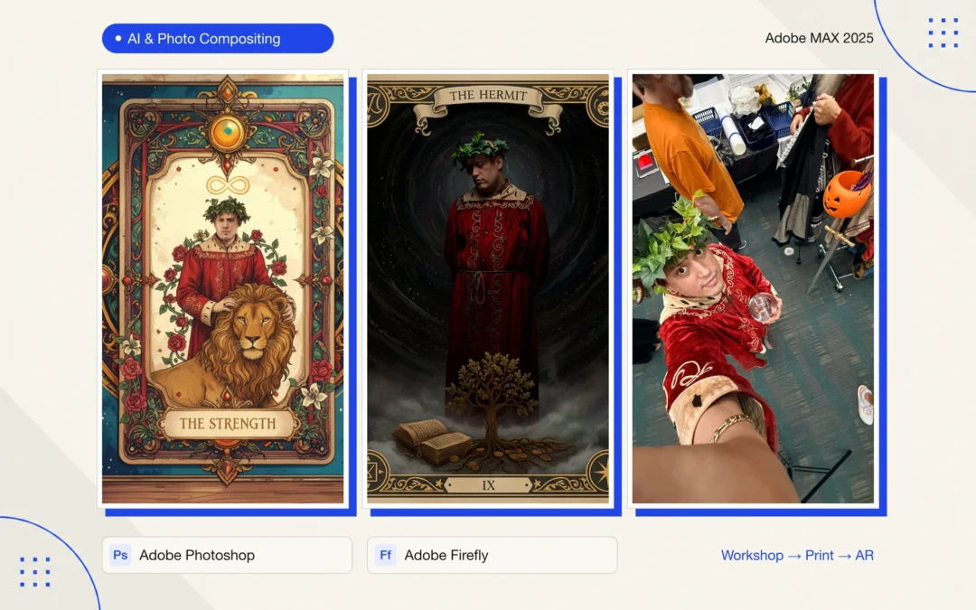
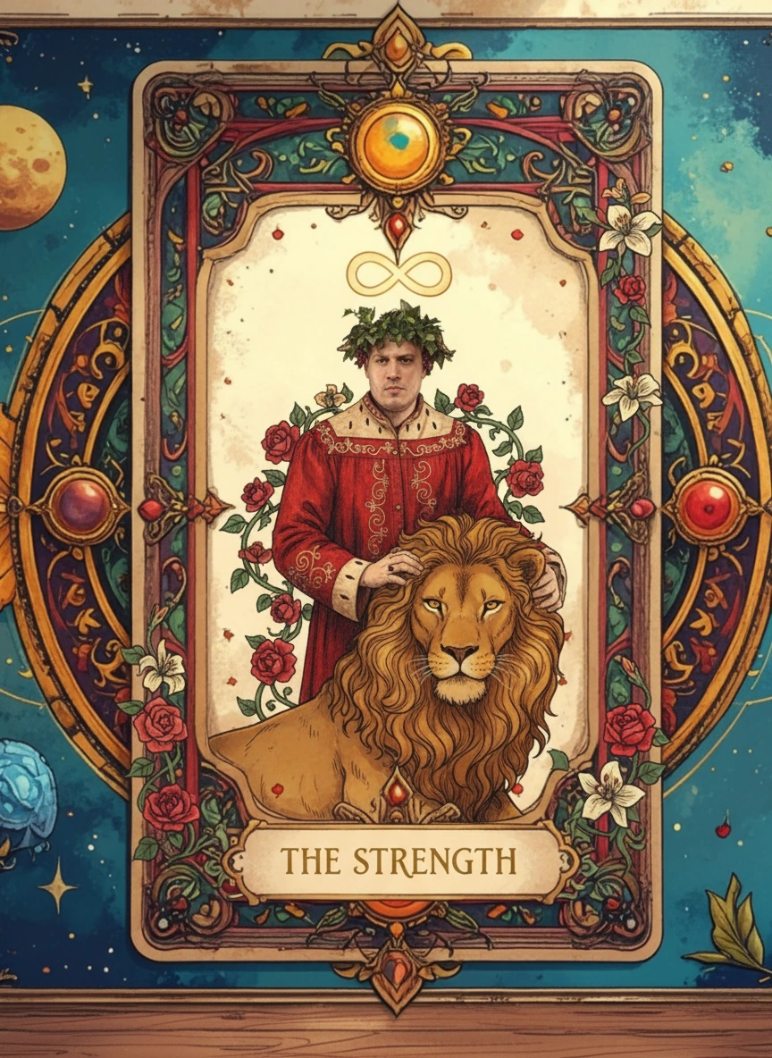
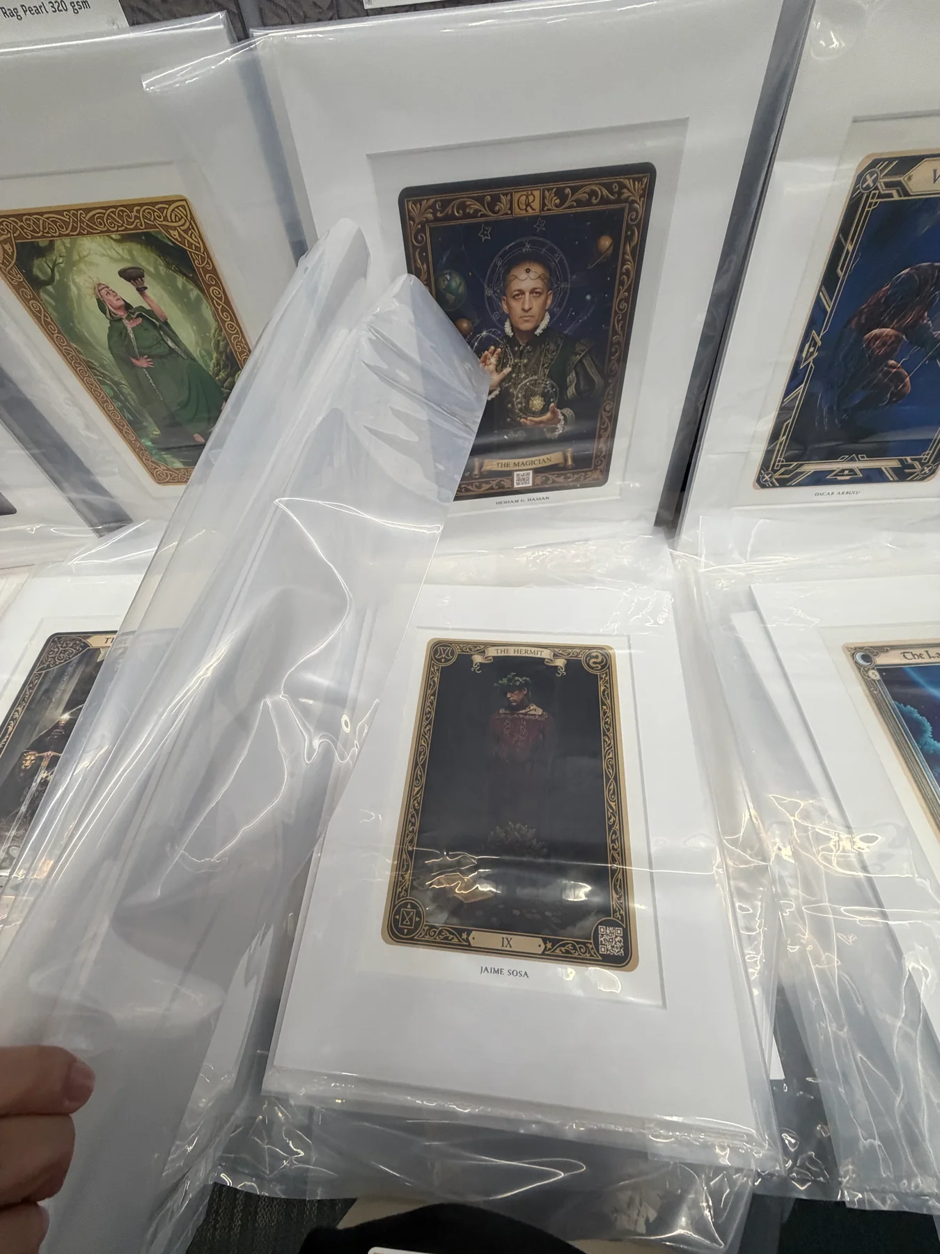
The final Hermit design combines a red costume, gold decorative framing, and a dark, textured setting. The Strength exploration shows another direction within the same creative process, using brighter colors, floral elements, and a lion motif. Together, the pieces show how I translated a personal photograph into distinct visual narratives while applying what I learned about Firefly and Photoshop.

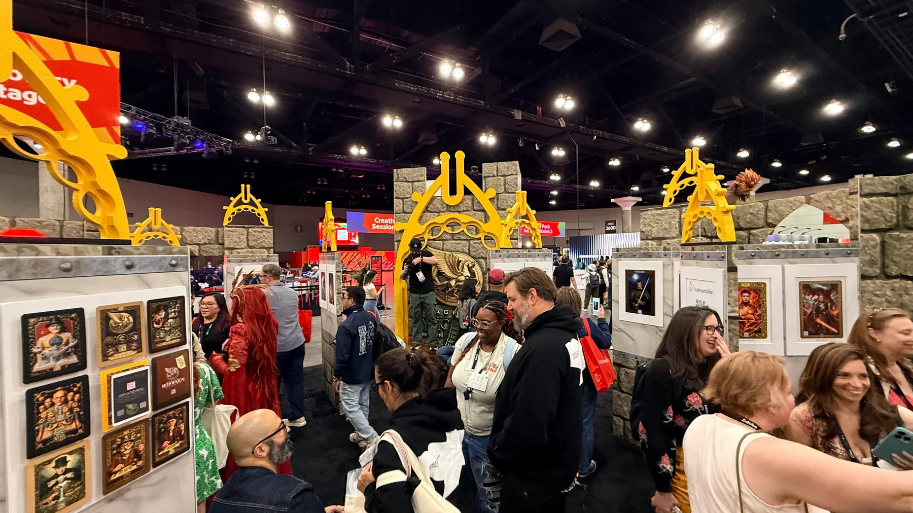
The work extended beyond the screen. The pieces were printed and presented as part of the official Adobe MAX event, within a workshop exhibition that incorporated augmented reality. This added an interactive layer to the printed artwork and connected image-making with a physical gallery experience.

It was a unique experience that significantly strengthened my design skills. The project expanded both my confidence with AI-assisted creative tools and my ability to turn experimentation into a finished, coherent visual piece—from the original photograph to the final printed presentation.

The Hermit tarot portrait designed by Jaime Sosa in Photoshop and Adobe Firefly, featuring his photograph in a red costume, an ornate gold border, a tree, and an open book.
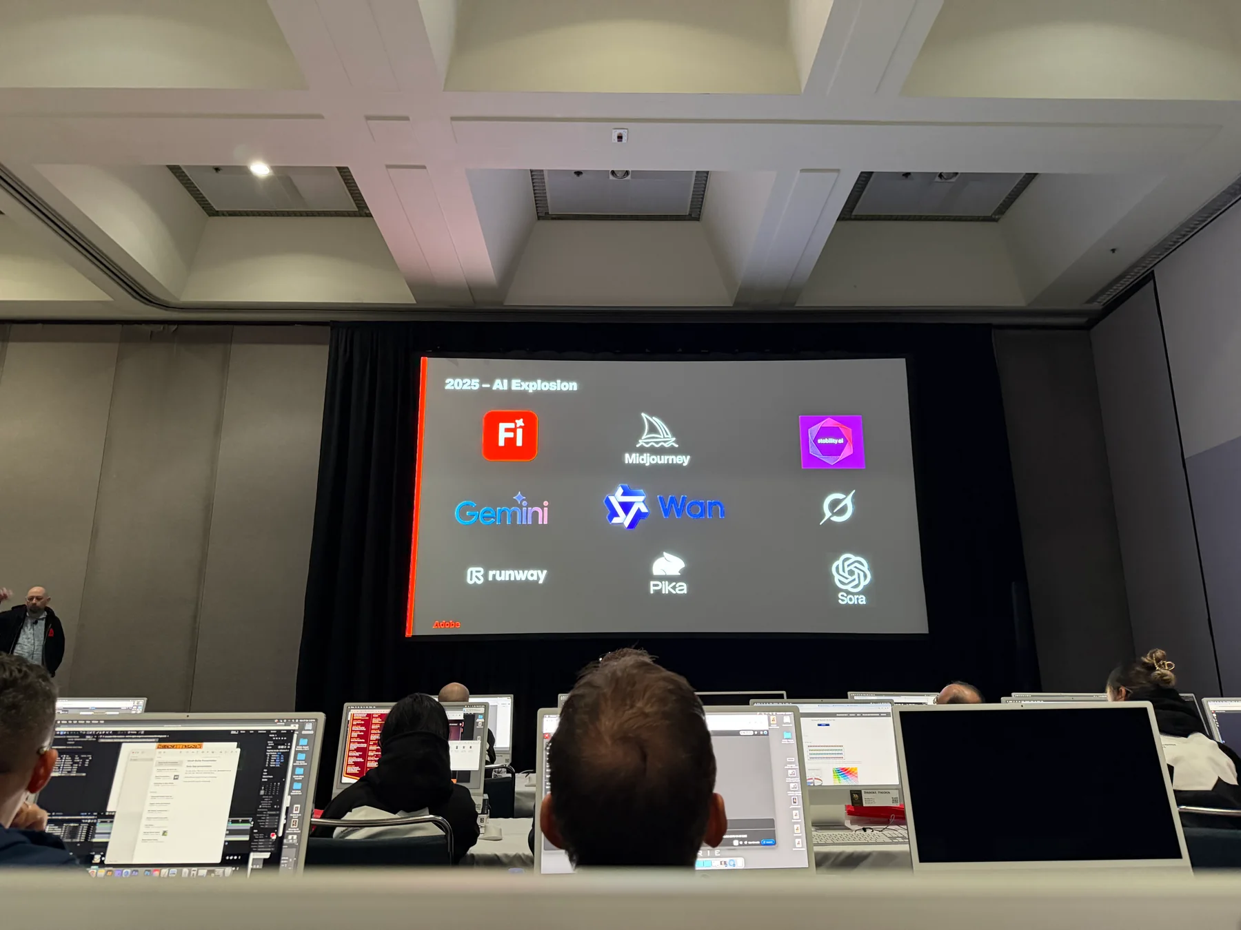
Classroom session during Russell Brown’s Adobe MAX 2025 workshop, where Jaime Sosa developed his Photoshop and Firefly tarot portrait project.
Tarot artwork displayed in the Adobe MAX 2025 gallery, where Jaime Sosa’s printed workshop design was presented as part of the event.
The Strength tarot design exploration by Jaime Sosa, featuring his portrait, a lion, floral elements, and a colorful ornamental frame.
Printed tarot artwork prepared for the Adobe MAX 2025 exhibition, documenting the print presentation of Jaime Sosa’s workshop project.
Jaime Sosa wearing a red costume and leafy crown during the portrait photography process for his Adobe MAX tarot design.
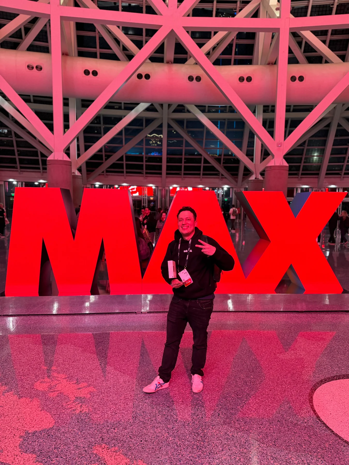
Jaime Sosa at Adobe MAX 2025, documenting the event where his tarot portrait design was presented.
FORTA | Educational Publication Design

FORTA | Educational Publication Design

Graphic Design

Client: FORTA
Role: Editorial design and page layout
Tools: Adobe InDesign, Adobe Illustrator, Adobe Photoshop

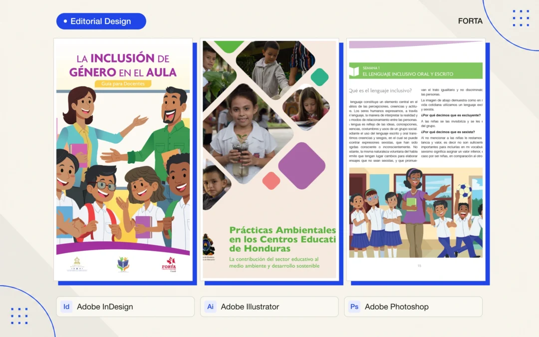
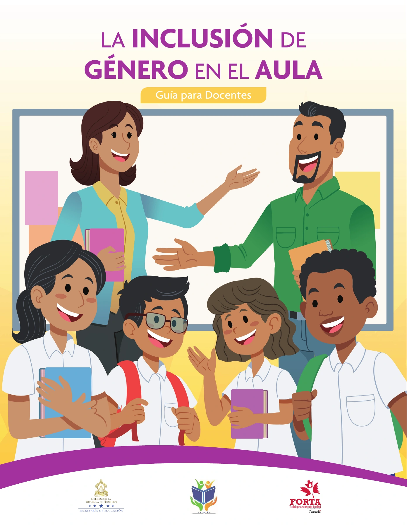
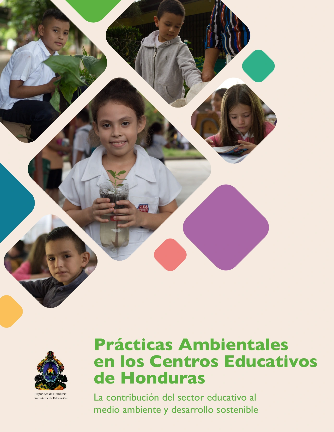
I designed educational publications for FORTA, including a guide to gender inclusion in the classroom and a cover for environmental practices in Honduran schools. These materials were developed collaboratively with specialist and institutional teams. My contribution was the editorial design and page layout.

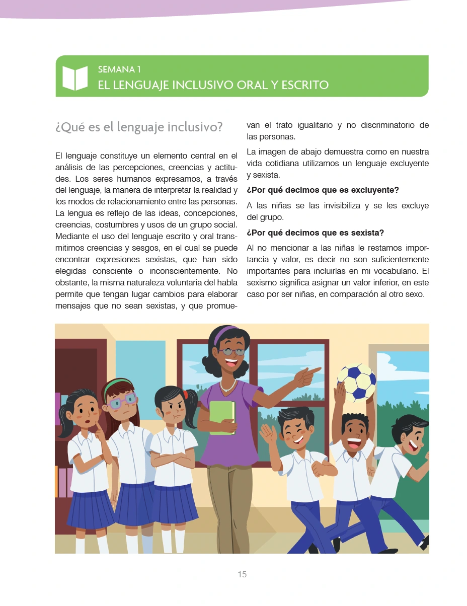
The gender inclusion guide pairs a clear typographic hierarchy with colored section markers and supplied classroom illustrations. Two-column layouts organize longer explanations, while larger illustrated areas provide visual pauses within the reading sequence. The environmental publication cover uses a photographic composition and geometric shapes to connect school activities with its subject.

I used Adobe InDesign to develop the layouts and maintain consistency across headings, body text, margins, and page elements. Illustrator and Photoshop supported the preparation and integration of graphic and photographic assets. The design process centered on making the supplied educational material readable, organized, and visually coherent.

The content and technical review were led by the collaborating teams. Illustrations in the gender inclusion guide are credited to Allan Paz; my role was to integrate them into the publication through layout and visual design.

Gender inclusion teacher guide cover designed by Jaime Sosa for FORTA, integrating classroom illustrations by Allan Paz with purple and yellow typography.
Environmental practices publication cover designed by Jaime Sosa for FORTA, combining school photography, geometric shapes, and green typography.
FORTA guide page laid out by Jaime Sosa, featuring a green section heading, two-column text, and a classroom illustration by Allan Paz.
Oxfam Toolkit | Editorial Design

Oxfam Toolkit | Editorial Design

Graphic Design

Client: Oxfam
Role: Editorial design and page layout
Tools: Adobe InDesign, Adobe Illustrator, Adobe Photoshop

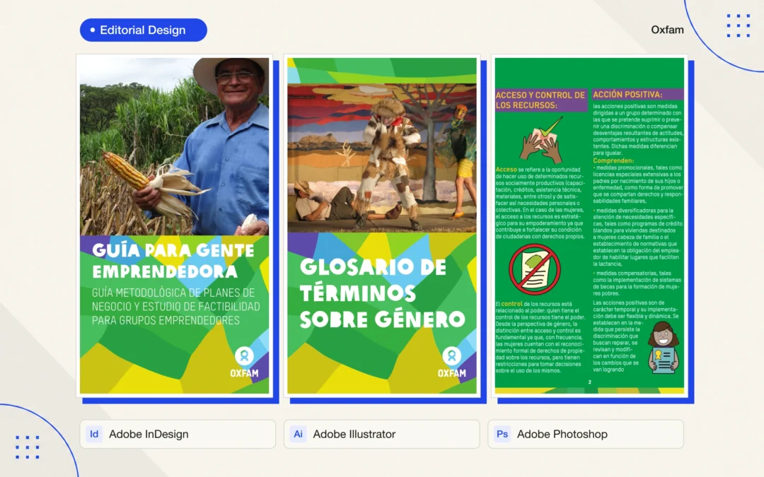
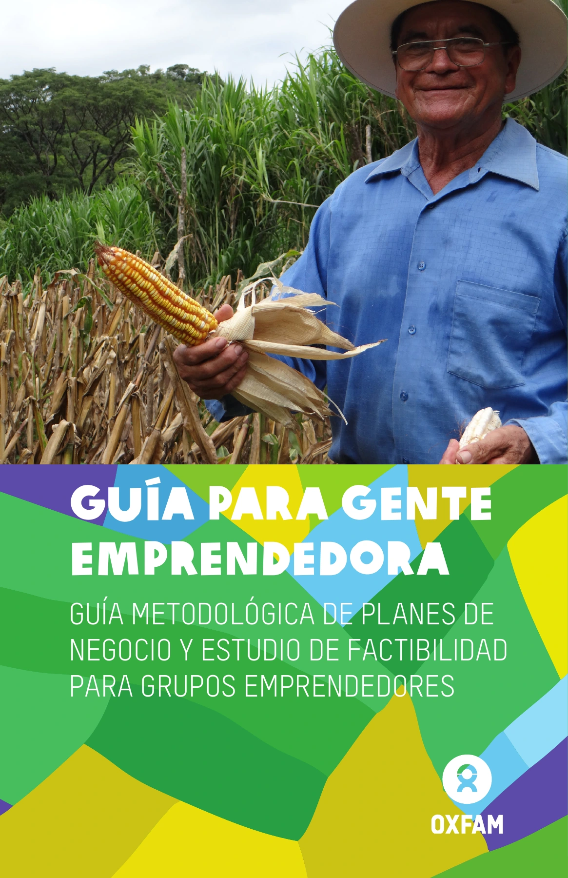
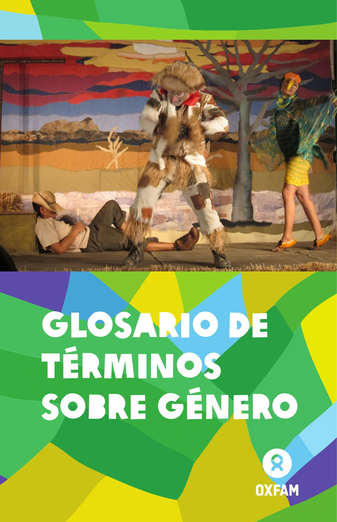
I designed a collection of editorial resources for Oxfam, including an entrepreneurship guide and a glossary of gender terminology. Developed collaboratively with consulting and technical teams, the project brought specialist content into a coordinated set of publications. My responsibility was the visual design and page layout.

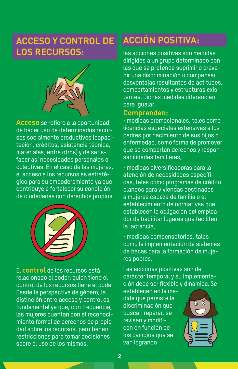
The design connects the publications through a shared green palette, geometric color blocks, prominent typography, and photographic covers. Inside, clear headings, column layouts, and the integration of supplied illustrations help readers navigate definitions and practical guidance. The visual system gives the materials a recognizable identity while accommodating different types of content.

I used Adobe InDesign for page composition and typographic consistency, supported by Illustrator and Photoshop for graphic assets and image preparation. My focus was on organizing the supplied material, balancing text with visuals, and maintaining a consistent reading experience across the publications.

The written content, technical development, and supporting visual contributions were created by the collaborating teams and contributors. This portfolio entry highlights my editorial design and layout work.

Entrepreneurship guide cover designed by Jaime Sosa for Oxfam, combining photography, bold white typography, and green geometric shapes.
Gender terminology glossary cover designed by Jaime Sosa for Oxfam, using coordinated photography, typography, and geometric graphics.
Oxfam editorial layout by Jaime Sosa, with a two-column green page, purple headings, yellow accents, and supplied illustrations.